Claudia's Media Coursework.
Monday, 21 March 2016
Saturday, 5 March 2016
How did you use New Media Technologies in the construction and research, planning and evaluation stages?
How did you use new media technologies in the construction and research, planning and evaluation stages.
Technologies I have used across the two years:
I decided to create this diagram to show all the different types of technologies that I have used across the two years of my A Level media studies course. The technologies have advanced hugely from AS to A2. The first thing I did was to use the internet and YouTube to research other opening sequence thrillers to help identiy conventions within these, The next technology used was the Sony NX5, which was the camera I filmed my AS Thriller opening sequence. Then to edit this sequence, I used Adobe Premier Pro. To help me track the progress, I also used technologies such as Prezi, Blogger, YouTube and Slideshare.
In A2, the technologies advanced. I filmed my music video using A Sony FS100 camera and also edited it on Premier Pro, However, this time there was another layer added as my group and I had to colour grade the video to make sure the shots all matched and make it fit the message we were trying to portray, we done this by using pink tones. I also created a website using wordpress, which is a technology I had never used before. We edited the digipack using Photoshop, lightroom and after effects, all of which helped to create a product that was to a professional standard and part of a successful campaign.
Throughout this task, I have used both online and offline editing, using software, hardware and digital technologies.
Script:
The Script:
GH: During the shoot, we used various technologies to film our video. Before each shot we used an ipad that was linked to the surround sound system in the studio.
We held up the screen with the song time to the lens of the camera, until a beep came that signalled the beginning of the song. This therefore told us and the artist lip syncing that he had 4 seconds until the song began, and also made it easier for us in the edit to know where to place the visuals so that they matched the track.
We did the majority of the filming using a Sony FS100 camera and prior to each shot we took, we had to focus the lens and white balance the shot by zooming in on a white area, adjusting the colour and then zooming out and arranging our shot. As we were filming, each member of our group would take a turn operating the camera, while the other three watched and directed from a TV that was placed out of the way of the set.
CH: Having the TV made our filming process much easier, as there would not have been enough time on the shoot day to re-watch our footage so it allowed us to see whether what we were filming worked and if the shots were going to be efficient enough to be used in the edit.
We used a second camera on our video shoot – a Canon 5D camera to film the set where Sasha was upside down. This was a much better suited camera for this artistic cinematography that we wanted to achieve.
As we had to be up-close and on the floor, using the FS100 would have been too bulky, and the lens was too close to the ground. By using a lighter camera, physically filming the shots became much easier and we were able to move the camera much more easily because it is so light. This digital technology also enabled the quick transfer and uploading of footage to a mac computer.
GB: Finally, this was our most artistic shot and using a lens that easily focuses on the artists face our shots came out in a very high definition. The only con with using this camera was that we did not have time to link it up to the TV, and so we could not judge whether our shots were usable as we went along. We then realised when we got to the edit that a lot of our footage was out of focus.
When filming our music video, we used an iPad for playback at the start of each shot. We did this so that when it came to editing, it would be much easier for us to be able to sync the clips to the audio that was already on the timeline, to make it look like our artist was actually singing the words.
When filming our music video, we used an iPad for playback at the start of each shot. We did this so that when it came to editing, it would be much easier for us to be able to sync the clips to the audio that was already on the timeline, to make it look like our artist was actually singing the words.
We did this by using the arrow keys to slowly move along our footage, and then we found the point at which the frequency was highest on the playback clip, then we knew to cut the video, using the blade tool at the point and then drag the clip back along the timeline in order for it to be correctly synced.
When we edited our video we used colour grading to help bring out our music video. We used a slight hint of pink to show that our artist is girly as this would relate to our target audience. This made the video look more edgy and appealing to the audience. As our song is very fast paced we decided to make our cuts fast. For example, in the UV set the cuts are rapid, this helps as it goes to the beat of the song and is interesting for the audience to watch.
When we edited our video we used colour grading to help bring out our music video. We used a slight hint of pink to show that our artist is girly as this would relate to our target audience. This made the video look more edgy and appealing to the audience. As our song is very fast paced we decided to make our cuts fast. For example, in the UV set the cuts are rapid, this helps as it goes to the beat of the song and is interesting for the audience to watch.
LM: By having four different sets this allowed our artist to be seen in different perspectives. Which makes our artist relevant and can appeal to different types of people, which means our artist can branch out and not just stay with one group of people. We had to export our video into a MOV file, which means it can be seen in high quality, after exporting it we then uploaded it onto YouTube.
By having it on YouTube we can see who, when, where and why people are watching our music video. We can also see the age of our viewers which will enabled us to see if we successfully grabbed our target audience.
By using Adobe Premier Pro as the software to edit our music video we were able to complete the offline and online process of editing in a quick manner. In the offline process of editing we watched through all our clips to see which ones were effective and could be used in our final product. After sleeting these clips we put into a folder known as the ‘rushes’ folder. We then named each clip to help us identify the clip without having to watch each one over and over again, making the editing process faster and more manageable. We used was the ‘razor’ tool to allow us to cut and shape our clips so that they could match with the pace and the tempo our chosen song.
By using Adobe Premier Pro as the software to edit our music video we were able to complete the offline and online process of editing in a quick manner. In the offline process of editing we watched through all our clips to see which ones were effective and could be used in our final product. After sleeting these clips we put into a folder known as the ‘rushes’ folder. We then named each clip to help us identify the clip without having to watch each one over and over again, making the editing process faster and more manageable. We used was the ‘razor’ tool to allow us to cut and shape our clips so that they could match with the pace and the tempo our chosen song.
After organising the clips we placed them onto the timeline by looking at the playback times and syncing the lip-sync of our artist up with the lyrics in the song, this made our video look more realistic and adhere to all of the ‘pop’ conventions in a music video.
To conclude, I have used technological convergence to help create a professional and successful media campaign. By using the Sony NX5, Sony FS100, Adobe Premier Pro and uploading my final products to YouTube, I have become a prosumer. This also enabled my video to become accessible to people in far eastern markets, such as Brazil, which I never knew existed. Throughout this course, I have been able to widen my skills which has helped me how to organise and create a video using semi professional equipment. Digital technologies have allowed me to upload, share and distribute my products using YouTube as a free broadcast platform. Audiences have been able to give feedback by liking, sharing and commenting on the video and also completing surveys on sites such as Survey Monkey. I have really enjoyed this experience and it has enabled me to gain experience not only as a user of digital technology, but also as a producer, which is essential in understanding the media in the online age.
Monday, 8 February 2016
Friday, 5 February 2016
How effective is the combination of your main product and ancillary texts?
How effective is the combination of your main product and ancillary texts?
Thursday, 4 February 2016
In what ways do your media products use, develop or challenge forms and conventions of real media products?
In what
ways do your media products use, develop or challenge forms and conventions of
real media products?
A convention is something that we expect to see in a certain genre; it helps the audience identify what genre the music product (in my case, my music video) falls into. So typically, in a pop video, you would expect to see bright colours and lighting, quick cuts, dancers and a dominant artist or band. There are three types of codes; technical, written and symbolic, all of which can be decoded to create messages and meaning.
Performance.
A convention that is always found in a pop video is the performance element of it. After auditioning dancers, we chose two dancers to go along side our artist, we then created a routine that fitted with our song and taught it to them. It was important that we included this in our video as we wanted to show that our artist had many talents and we also wanted to put it in the video in the hope it may appeal to more of a male audience, which we later found out it didn't as the video was more girly and about girl power, but none the less, we still included it. The video consists of our artist and 2 other female dancers dancing in 2 different sets, the blinders set and the UV set. The lighting in the Blinders set allowed us to be able to flash the lights constantly to create a fun vibe. The bright colours that occurred in the UV set made the video visually appealing, different and fun. We took inspiration from Beyonce's 'Single Ladies' video as she is the main artist in the middle, with two female dancers either side. This also adheres to Dyers star theory and makes the artist look like she is friendly, fun and having a good time.
Finally, we also wanted to create a relationship between the artist and the audience and we thought a good way to do this was to get our artist to look directly down the camera lense and lip sync, which creates a direct address. This is also a convention of a pop video as the artists want to let their fans in and connect with them.
Mise En Scene.
Mise En Scene is everything we see in the frame, we looked at lots of pop videos to inspire ideas for our video. We wanted our shoot to be completely studio based as we only had 1 day to film, so this way allowed us to create 4 different sets, which is something we couldnt have done if it was shot on location as it would have taken too long to go to 4 different locations. We loved the flower fall that Lady Gaga has in her video G U Y. This also fitted our artist, as we wanted to call her ISIS, (before the Paris attacks) which means 'Goddess of Nature' this is also why she is wearing the crown in the video, to represent the goddess side, so the flowers represented nature. However, we couldn't get actual flowers as they would be too expensive so we used pink tissue lanterns that had many layers that we could make look like flowers, or even represent them. Rihanna also used a flower wall in her only girl in the world video.
We also come across Nicki Minaj's super bass video, which included a UV Section with feathers. We thought that this, visually, looked really good, so we wanted to use it in our video. However, instead of creating everything UV, we ordered UV face paint to create cool designs on the shoot and used black and white costumes that would show up as UV- this gave the same effect.
As the song is also about Girl power, we wanted to have a really girly set, so we come up with the idea of creating a really girly pink set. This is similar to Ellie Goulding 'on my mind' video as it is very pink. It fits with the message of the song and the overall video, we also used a throne to re in force the Goddess, similar to Nicki Minaj's video, where she is seen in a throne.
Finally, our last set was a projections set, we got this inspiration from Rihanna's U DA ONE video, we thought it looked different to things we had seen in other videos, so we decided to include it in our video.
All of the above help to create a star image for our artist and give off the 'glamorous lifestyle' and 'everything is perfect' vibe.
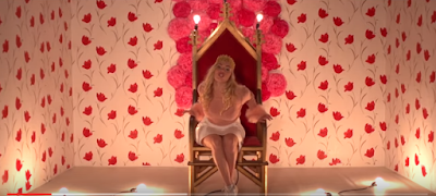
Girly Set.
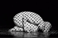
UV set.
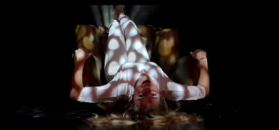
 Pink Lighting and Crown to portray female empowerment message. We took inspiration for our projections set from Rihanna's video to create a cool effect that we havent seen in that many video. It also shows another side to our artist as the rest of the video is very bright and active, where as this set is her laying upside down on a chair and she is staying still, showing she is versatile and does sometimes want to chill out like the rest of us.
Cast and Costume.
When it come to casting our artist, we thought of several different people as we were a little undecided on what we wanted. We picked a final girls, Hannah, Daisy and Sasha, who again, looked very different, but we thought we could try the costume on them and see which one fit the most.
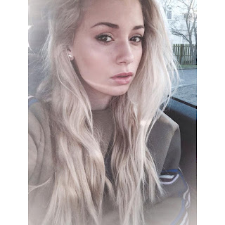 We found that Sasha fit the costumes and sets best and we also wanted to use her in the video as she is a good dancer and takes dance A Level, which we knew would be a huge help when it come to the choreography as it would be harder to teach a routine to someone who was inexperienced and may have felt uncomfortable dancing. Sasha also has blond hair, where as all the other girls had dark hair and even tho this isn't much of a problem, the blonde hair lightened the shots whereas the girls with brown hair, made the sets look a little darker, we could also use UV hair spray on Sasha, which didn't show up in the girls with brunette hair hair. Finally, both our dancers also had blonde hair, so they looked better and it was more visually appealing to look at when watching the video. So therefore we chose Sasha.
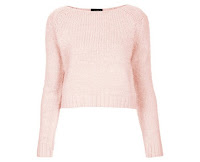
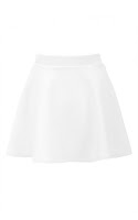
For the costume in the Girly Set, we wanted to create quite a casual but very feminine costume at the same time. We chose a white skater skirt, as the colour white represents pure and good, which is what our artist is. We paired the skirt with a pink fluffy jumper, which makes it girly. Finally, we added the crown to portray the empowerment and we put white trainers on her feet as we thought this would appeal more to the audience compared to heels, which could have been a bit over the top and a bit too formal.
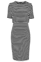 For the UV set we used a black and white stripy dress as white shows up the best in the dark/UV. So the stripe effect makes it look like there are only white stripes going horizontally across her body to make an effect which is visually pleasing to watch. We also bought the dancers matching dresses.
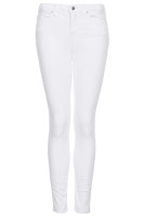
For the projections set, we wanted to keep the costume very simple. We chose a white leotard which would be easy to project the images on. However, on the day when the lights were shining on Sasha, the leotard became very see through so there fore it was no longer appropriate. Instead, we dressed her in a white top and jeans which created the same effect as the leotard and the images were able to be projected clearly. Sasha also wore this outfit in the Blinders set.
Camera Work.
Close ups, mid shots and long shots are all conventions of music videos, so we therefore used a mixture in our video. Our shots were very similar to Katy Perry's, Roar video, which also uses a mixture of shots. The close up's allow the audience to feel close to the artist, the mid shots, show things such as costume, sets and props in more detail and the long shots are used to show everything and can make the artist look powerful.

Editing.
As our track is very uplifting and upbeat our editing is very fast pace and cuts to the beat in order to fit the track. This was very important to do in the editing process as it is asthetically pleasing to an audience and makes the overall video look seamless. Another video that cuts to the beat is Kat DeLuna's Run the Beat. Editing is very important in music videos as it can create a very fun uplifting vibe or if done not well,it can become very boring very quickly. In order to make sure our video was kept upbeat, we kept cutting to different shots in the UV set mainly for the chorus, so bright colours and upbeat cutting could create the fun vibe portrayed in the video. The editing style us also a fast pace montage which is a convention of a pop video.
DigiPack
We got the idea of the inside right cover from Rihanna's 'loud' album, the disc of this album is also a rose,
The pink flower allows us to follow the theme of the girly ness which is portrayed in the video (and also follows the theme of the flowers on the wall) However, it isn't that much of an obvious link to the video, which is what we wanted. This is a convention of pop videos and helps attract our target audience. The idea of the front page come from
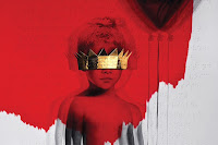
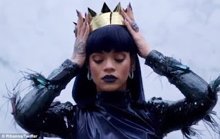
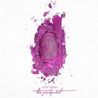 Rihanna's most recent album, Anti. The cover features a young girl with a gold crown across her eyes and as part of the promotion of the album, Rihanna was photographed wearing a similar crown that was on the cover and she also posted a photo on Instagram with the caption 'Listening to ANTI!!!' and in the photo, she is wearing a crown.We liked the idea of the crown as our artists name is Isadora, which means Goddess of Nature, so therefore the crown represents the goddess element, the album is also about female empowerment, so we thought it was crucial to have the crown on the front cover. For the back cover, we liked the idea of glitter as it is another girly feature and helps to target our target audience. We got this idea from Nicki Minaj's Pinkprint album.
Website.
http://laramariemurray.wix.com/isadora
On the homepage of our website, we have a huge image of our artist. This is important as it is the first thing that the viewer sees when they click on the site. Along with this image, they also see the artists name, in pink love hearts, following the female empowerment messages which is carried across the three products. The hearts and the pink background look fun and portray the message 'girls just wanna have fun' which is another message carried across our campaign. The colours also make the black and white image of the artist stand out. This is similar to Beyoncè's website homepage as she also has her name and then an image of herself, with a black white and pink theme.
 Another feature of our homepage is the social media widget, which instantly allows fans to connect with the artist directly via twitter and facebook etc. This was crucial to have on the front page as fans interact with each other on these social media sites. They also spread links to music videos and other websites associated with these artists via these sites, so it is important that they know where to find all this information, which will be regularly posted and updated on Isadora's social media sites. Some labels also require artists to have a certain following on social media before they can even release an album, so it is important the word about her gets around and people start following and connecting with her. Finally, the last thing we have on the homepage is the video to snap clap and an embedded link to download the single (but by the original artists Icona Pop.)This is essential to the homepage so people can see her latest work and can share it globally and if they like the video and the artist and the messages she is trying to put across, then hopefully they will download the single/album.
We included other features on our website such as a gallery and tour page, which are common pages on other female solo artists websites.
Conclusion.
Overall, I feel that i have drawn on the conventions of media products in my own campaign. The use of these conventions is obvious in the construction of my own products for example, the colour pink is used across the campaign and this helps to portray the female empowerment message we wanted to put across. This is supported by my own research into Ellie Goulding's 'on my mind' video, where pink is also a common colour used. Conventions are relied upon to communicate the right message to the target audience but they also help sell the star image that I want to promote.
Subscribe to:
Comments (Atom)


